You know how to prepare and set Facebook ads at this point, right? But you might need some extra inspiration to make a really good campaign. Facebook ads aren’t just supposed to be targeted at the right people. They’re also meant to be catchy, memorable, and easily encourage you to act.
Want to get inspired by some especially good Facebook ads? Let’s take a look at some of the winners to get a better idea of what direction you should go in.
Why did we consider these as the best Facebook ads?
Everyone has their own idea about which ads are the best, the worst, most, and least effective. We’ve talked about some of the Instagram advertising mistakes that you should watch out for, as well as good Instagram ads that we think you should take notes from. Although our opinions are subjective, we think you should still be able to take away some ideas for your own ad campaigns.
Let’s consider a few things that really make an ad on Facebook better than all the others we’ve seen.
- The format fits the content and the purpose of the ad.
- Ad copy is sufficient and not overly wordy. Instagram content can get away with being more like a blog post, but Facebook ads can’t.
- Try to capture their attention straight away with a not-so-subtle headline. Make it clear what you’re offering and why it’s good for the customer!
- Visuals, whether they’re static or moving, should be easy to interpret and grab users’ attention at a minute’s notice.
- Many people watch Facebook videos without sound. Consider using CC’s if you’re going to have a video ad. It’s also more accessible that way.
- There aren’t any unanswered negative or spammy comments in the comment section.
There’s more to making good ads than preparing the right target audience, as you can probably tell. 😉 In this article, you’ll see that some ads match different criteria more or less often, but they have two things in common: they are actionable and convincing. When you want your ads to convert, it’s just not enough to be memorable.
Let’s get started and check out some of the best Facebook ads we could find!
An expressive phone case
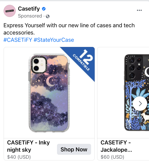
We can’t really get started without mentioning CASETiFY. They’re a company that creates phone cases, but you also have the option of customizing your own.
Their ads tend to work well because they display their phone cases and give you the shortcut to immediately go on their website to look at more products. They don’t even need much text to get the point across: this ad literally only has 11 words besides the hashtags. Also, the hashtags are great because one of them is the brand’s actual name, making it easier for users to find and tag their own CASETiFY products.
The format of the ad fits perfectly to get users to purchase phone cases quickly. Just showing off the phone case without making it easier to access the website wouldn’t work nearly as well. Finally, being able to quickly scroll through a catalog in their Facebook app gives them the chance to see some of your more impressive designs. If you include a variety of products together as they have (phone cases for both iPhones and Samsung Galaxy phones), you have a better shot at making them interested.
Promoting an online degree through Facebook
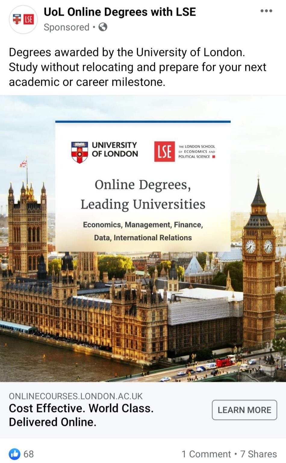
This ad by the University of London is definitely going to get a lot of attention, with so many active travel bans and obstacles for students outside of London. Now that remote learning and work have become normal, it’s important to get the word out about remote learning programs. The copy immediately tells you how you can benefit, and there’s a CTA that takes you to the university’s website.
The graphic they used makes sense, too. It’s an actual image of London (a big part of the selling point, if we’re being honest) and not just random young adult models sitting on the grass laughing at their salads. 😉
Secondhand clothing gets a second chance
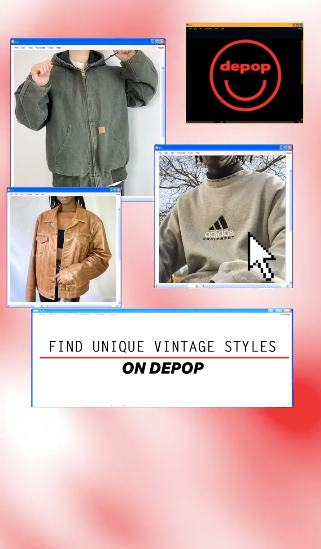
In case you missed it, Depop has become especially popular. Not just Depop as an app or platform itself, but thrifting and buying second-hand clothes in general. Buying second-hand is especially appealing to the younger generations. It’s affordable, the pieces tend to be unique, and the clothes tend to be of better quality.
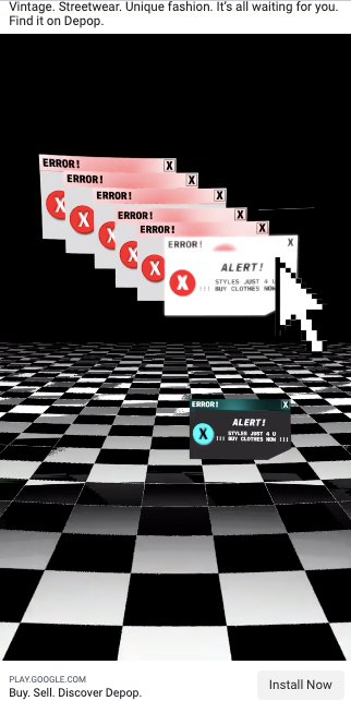
What makes Depop’s ads so good is that they clearly appeal to a specific demographic and aesthetic. Although many marketers wouldn’t consider the 90s and Y2K “vintage”, the Windows XP aesthetic really makes this ad interesting. Instead of making the ad only feature models, they’ve incorporated the whole Y2K aesthetic to set the mood. It’s a pretty fun and campy take on a fashion ad. They point out the most entertaining part about buying secondhand: the clothes you buy are unique. It challenges their fast-fashion competition because users can also offer lower prices, but it won’t be as easy to copy your style.
Specialized coding courses
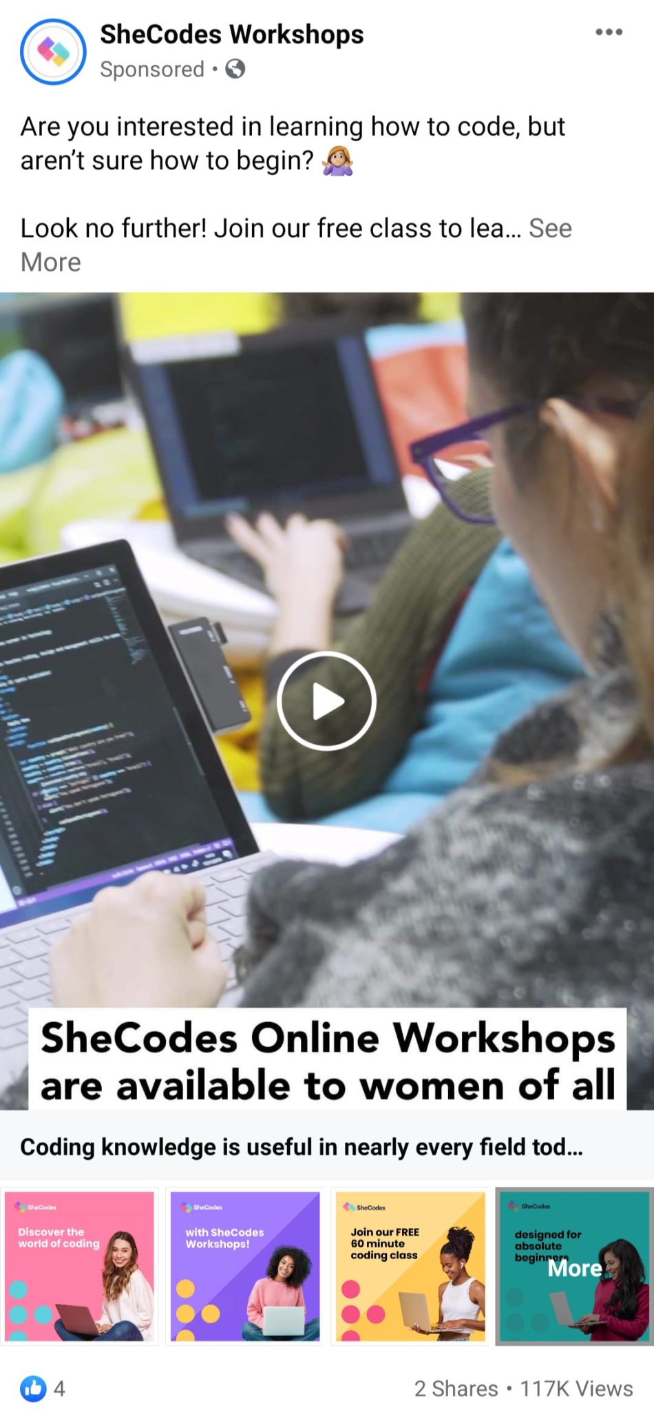
Meanwhile, SheCodes Workshops’ ad features a video and multiple images just like an Instagram carousel ad would. They do have a bit of text that stands out, but the most important parts are definitely the visual elements. They provide important information about the workshops which makes it easier to get the user onto their Page. This works well for an awareness campaign when you want more people to learn that your service even exists and can benefit them.
The trusted and secure car
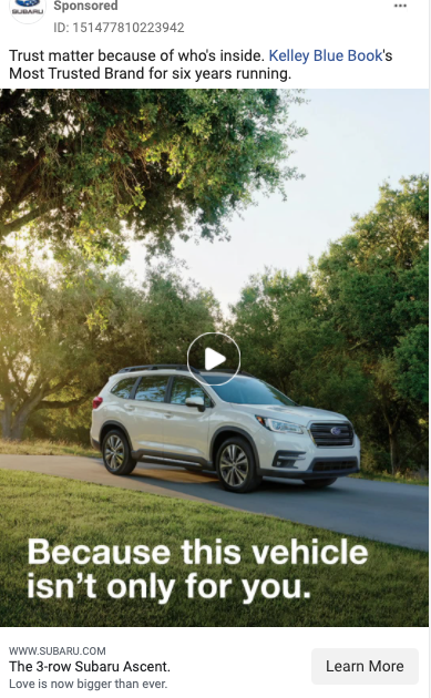
For most of us, buying a car is a pretty big deal. It’s especially a big deal when you’re responsible for other people. Subaru wants to get that message across while selling the Ascent model this year. The video ad starts off by showing us the model itself, then two happy kids in the car, followed by a review of the model. The review points out that the company’s products are considered to be safe for the sixth year in a row. There isn’t too much text, and the copy easily stands out from the visuals. Subaru successfully made you aware of three reasons why their product should be on your radar.
A fan-favorite makeup company
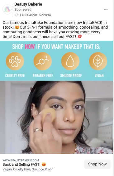
Not nearly enough people have heard of Beauty Bakerie. It’s a company that was founded by a breast cancer survivor, Cashmere Nicole, who wanted to give people the chance to buy makeup with healthier ingredients. Their goal to give customers healthier alternatives for makeup is directly reflected in their ads. This ad works for us because:
- It lists what makes their product special at the top and makes sure it stands out.
- Their copy is written in a friendly tone. Bonus points for using puns and the fact that they don’t spam emojis.
- You can see exactly how their product can be applied on a bare face. Actually, many of their ads will show you that.
- They create a sense of demand for the product and encourage you to buy their product while it’s still available.
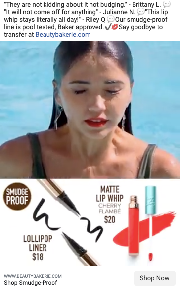
We don’t always recommend pointing out that one of your products will easily sell out. If a company like L’Oreal were to make it seem like they were running out of products, it would look ridiculous considering their resources. Considering that Beauty Bakerie is a company that’s made up of around 25 people and with annual revenue of 3.28 million USD (compared to L’Oreal’s owned NYX’s 500 million USD), this ad is pretty believable.
However, the qualities of the product itself are highlighted throughout the ad. It doesn’t go out of stock for no reason, after all. You can see in the ad that they repeatedly try to prove that their promises are legit. We appreciate ads that make promises they can actually keep!
A realistic travel backpack ad
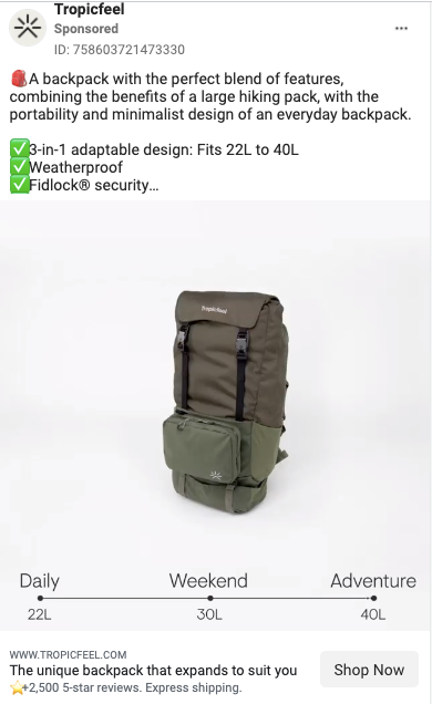
TropicFeel’s ads were definitely one of the better types of ads we’ve seen. It was one of those moments where you see an item that you actually really wanted but just didn’t know which brand to buy it from. So what makes their ads so good?
Let’s start with the copy. The copy is always relatively simple, using the product’s advantages as a checklist. In a way, it implies that these aren’t just things that are nice to have, but are a must (for example, the fact that it’s weatherproof).
The first ad is a video that shows you how their models range from 22 liters all the way up to 40, and how you can adjust the bag to the type of traveling you’re doing. They open up the different corners and compartments of the backpack to show you how much you can actually fit in there. Even the sliding transition at the bottom of the ad showing you how much space you add with each new compartment is helpful. You can easily make the right choice when it comes to sizing because it’s not as ambiguous.

They also have another product that they advertise alongside the backpacks. Their Shells are a great replacement for packing cubes, since all you have to do is just pack up and it will fit perfectly inside the backpack. The copy here is equally smart – one of the reasons why consumers might pick a regular suitcase instead of a backpack for traveling is the issue of space and organization. An everyday backpack might not fit everything we need, but a trekking backpack runs the risk of having to be checked in, or it might just be frustrating to pull everything out of there and make a mess. You see where this is going, right? A pretty good middle ground.
As for aesthetics, showing their products in the relevant environment makes it easier to see just how useful their products are. Instead of unpacking everything and keeping a messy bag, you can hang up the shell and have a hanging wardrobe for yourself!
Creating your own campaigns? Easy.
In our humble opinion, these were some of the best Facebook ads that we could find out there. You should have more than enough inspiration to help you get started on your own campaigns.
Just don’t forget to regularly look for ways to optimize your Facebook ads. You will still have to test out different copy, visuals, and targeting until you perfect your ad campaigns. However, checking your Facebook ad analytics and comparing results across campaigns definitely helps with improving future ad campaigns. You might realize that more localized ads get better results, or that promoting your app through Facebook just doesn’t get you the results you want. Whatever the outcome, there will always be a solution!
We’ve looked at some of the better ads that different brands and organizations placed on Facebook. Take what you’ve learned from this article and get ready for your next ad campaign. Good luck with improving your campaign’s KPIs this quarter!
