You might have the best product or offering. But without a good social media landing page your conversions are bound to suffer as it won’t compel customers to take the required action.
So, how to create a social media landing page that converts?
In this article, we’ll cover everything about how your social media landing page should be and the elements and tips that can help you enhance it.
This article covers:
- Points To Keep In Mind Before You Design Your Landing Page
- What To Do For A High Conversion Landing Page
- 5 Tips For A Great Social Media Landing Page
- 5 Examples Of An Awesome Landing Page
Points To Keep In Mind Before You Design Your Landing Page
Social media landing pages that are specifically designed for a purpose can help you boost conversions. Here’s what you should keep in mind before designing a social media landing page to ensure maximum profits:
- The goal: The first step of designing a landing page is to have clarity on its goal. This goal can be getting your viewers to make a purchase, sign up for a newsletter or to collect their email addresses.
- The target audience: Your landing page must be designed to serve your target audience and address their problems to convert them using account based marketing. You must understand what they need and expect from a brand to deliver the best solution through your landing page.
- The competition: Before designing a landing page, get insights into what your competitors are doing and how they are performing. If your competitor has highlighted certain elements like pricing, pain points, etc., take inspiration from it and modify it to suit your audience.
- The trends: The kind of content and designs that make a winning landing page vary from time to time. Earlier marketers could get away with chunks of text on a landing page, but now, it’s important to add media and pay attention to design to convert customers.
What To Do For A High Conversion Landing Page
Now that you know the important points to remember before designing your landing page, here’s what you must do while designing to increase the chances of conversion from it:
1. Write attractive headlines
Ignoring the headline and the sub-headline is a costly mistake to make as your readers decide if they want to read further or not after they look at it.
One way to ensure that your heading compels your customers to read further is to highlight the pain points or benefits people will get from using your product. For example, if your product is a pain-killer, you might want to highlight how the pain cripples your prospect. And if your product will yield results in the future, highlight the benefits it’ll bring in the future.
Once you’ve written the headline use the sub-headline section to elaborate how your product eliminates pain or adds benefit.
2. Elaborate on the pain points/benefits
Once you’ve set the stage with your heading and subheading, elaborate on the pain points or benefits in this section to drive home the point that your readers need a solution right away.
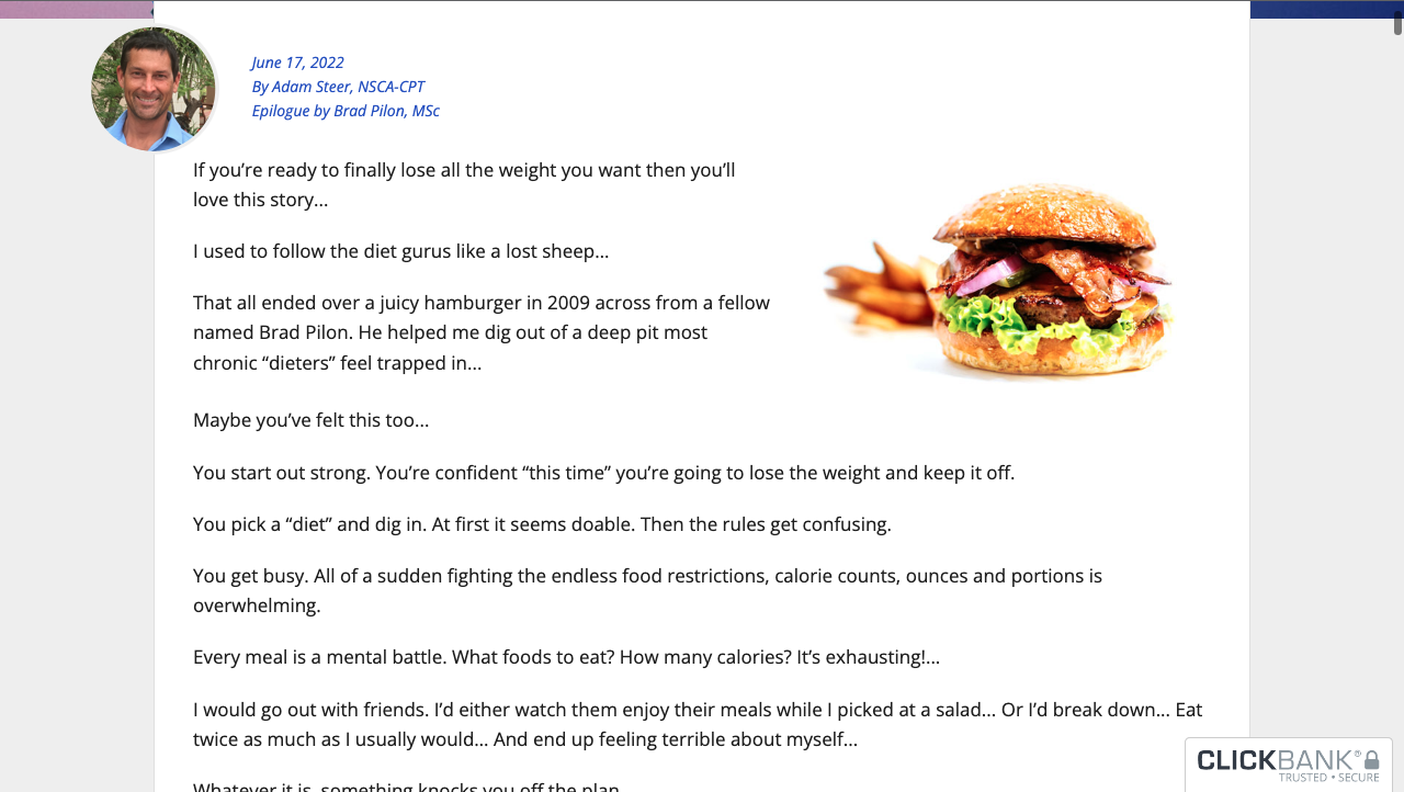
Create a relatable story with your persona at the center of it and talk about how this pain point or benefit impacted their life.
For example, look at how Eat-stop-eat highlights how the founder himself went through grueling diets and saw no results to relate better with the audience.
Source: eatstopeat.com
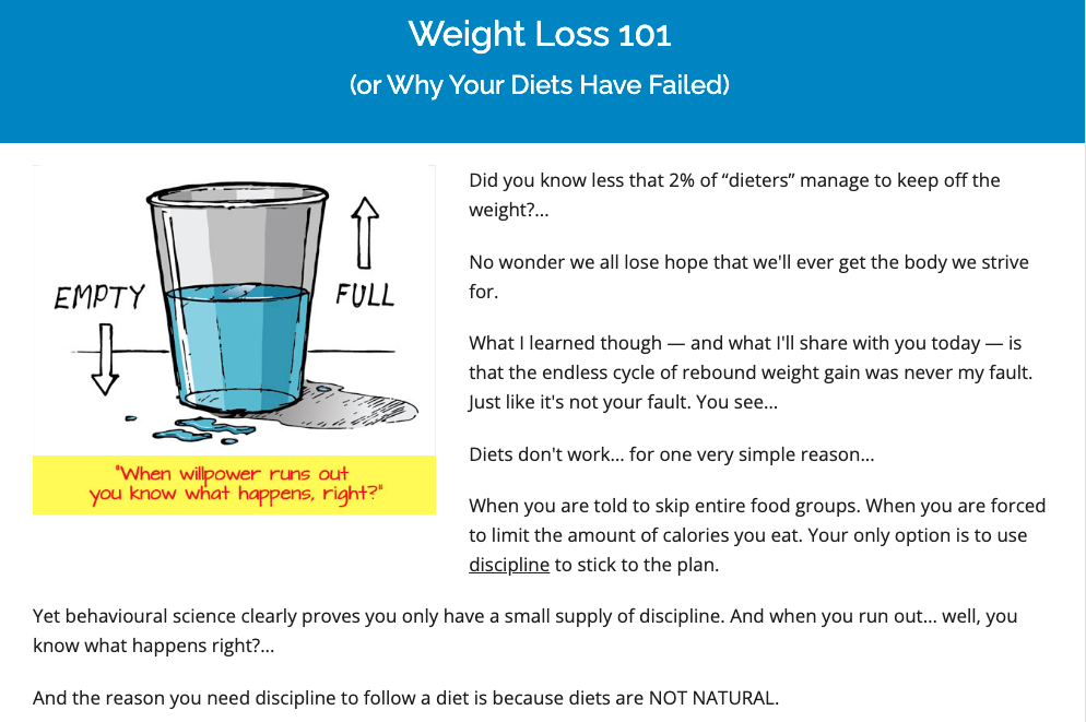
Then, get into why their previous solutions didn’t work to remove any objections they may have about your product.
Source: eatstopeat.com
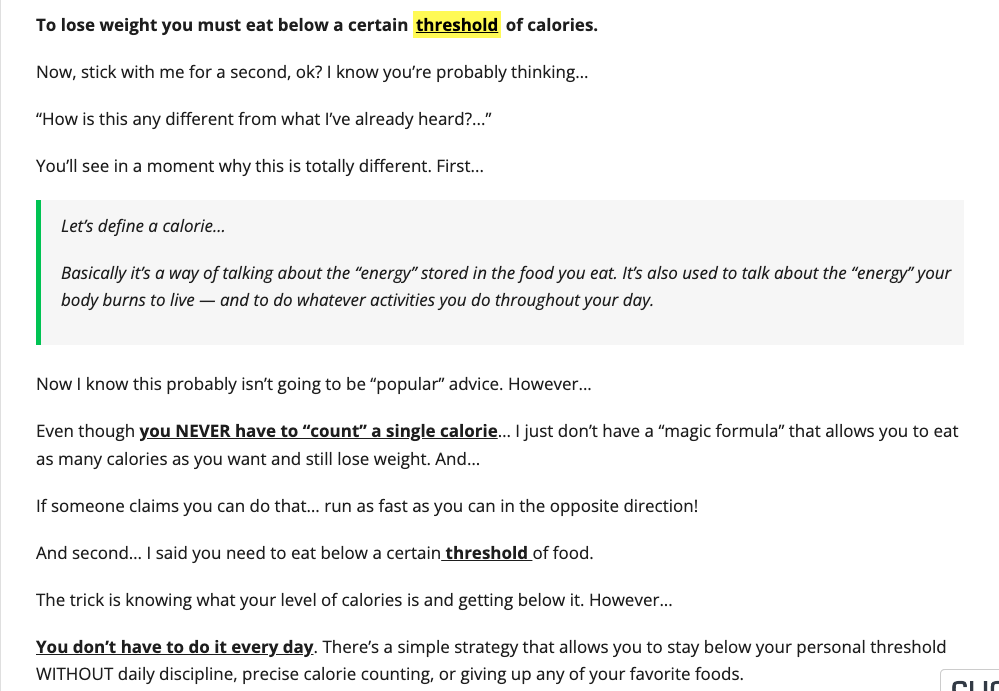
Once you’ve built up the momentum with these steps, get into the solution and talk about why your product is different from the others in the market to get one step closer towards converting your customers.
Source: eatstopeat.com
3. Use testimonials
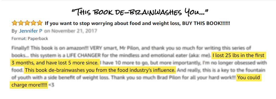
Even though you’ve backed up your solution with research and facts to make it credible, there’s nothing like a testimonial from people like them who saw results from using your products.
People trust what others have to say about your brand more than anything else. So, adding customer testimonials and reviews are a sureshot way to increase conversions.
Source: eatstopeat.com
You can even use statistics or before vs. after pictures of how your products or services have benefited your customers and have helped them grow to get your prospects to take action.
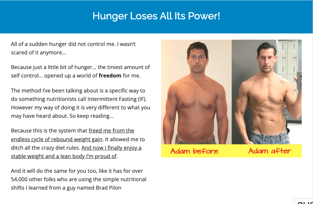
Source: eatstopeat.com
4. Create exciting CTAs
The CTA or the call-to-action is what you want your audience to do after visiting your page. So, this next step must be clear and simple to leave no room for further questions or confusion. Having clear CTAs like ‘Buy now’ or ‘Sign up today’ can attract more visitors to click rather than a vague CTA.
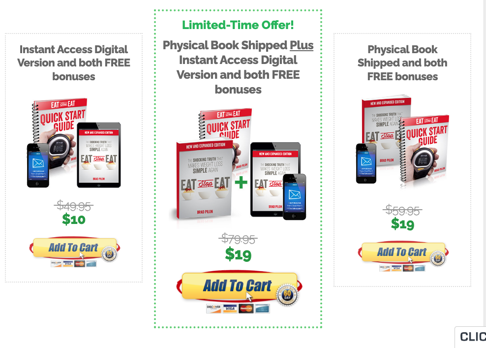
Source: eatstopeat.com
Exciting CTAs with a simple message work because the message reaches directly to the audience. It is also important to highlight one CTA rather than distracting the audience with too many instructions.This will help them move down the funnel smoothly.
5. A/B test your landing page elements
It’s not necessary that your landing page starts bringing leads to your door from the beginning. That’s why it’s important to conduct A/B tests, look at analytics, and tweak it accordingly.
A/B testing is the method of tweaking individual elements of your page to see which one performs the best. Employing it to your social media landing page elements helps you bring out its best version.
For instance, you can test between two CTAs and see which one has higher click-through rates or test between different design elements. Or you can utilize market segmentation to test different designs on different segments to test which work better.
You can then analyze the results to see which version gains more and brings visitors with better lead scoring. For instance, if you sell on shopify, integrate shopify with google sheets to collect insights and study them.
5 Tips For A Great Social Media Landing Page
To increase conversions, you must create a strong and lasting impression with your social media landing page. These 5 tips will help you do the same:
1. Make taking action easy
Cut out complicated language from your CTAs and instructions to make taking the next step easy. Your goal must be to make the conversion process short and minimize barriers like miscommunication or confusion. Depending on what you want your visitors to do, make doing it a piece of cake.
For example, if you want them to sign up for a trial, highlight it in your social media landing page with bold text and colors. If you want their email address, ask for it with a message that makes it irresistible.
2. Talk about the visitor
To keep your visitors interested, talk about ‘how they benefit’ rather than ‘how you are the best’. You cannot expect them to choose you unless they are convinced about the benefits your product or service provides them.
So, focus your landing page on showing how you can improve their life and make it easier with what you can do. Once they find the value they are seeking for in your brand, they are more likely to convert.
3. Use images and videos
Using images and videos in your social media landing page can enhance its visual appeal as well as help you communicate with your visitors more effectively. Images can be used to show different aspects of your product and also how it works.
On the other hand, videos provide higher engagement than any other form of media. Using videos to demonstrate a product or using video testimonials can make your landing page more interesting.
4. Ask for only the necessary customer information
Asking for too much information from your customer can make them skeptical about building a connection with you. So ask for the information that’s necessary for you. Because asking for email is non-intrusive whereas asking for date of birth or address makes them hesitant to go forward.
So, if you want them to sign up for your newsletter, asking for the name and email address is enough for you. But for a platform like Zillow where asking for an address becomes necessary, make it easier by asking them for the area rather than an exact location.
5. Make your pages device friendly
Out of 4.48 billion social media users, about 99% use it from their mobile phones. If you don’t have a landing page compatible with mobile phones, you are losing a lot of conversions. Even if your social media campaign is perfect, uses the best SMM panel for growth and drives a huge number of visitors to your landing page, it won’t convert.
The inconvenience of navigation will drive the audience away. Making your landing page device friendly can help you boost conversions by establishing it among a large number of alternatives.
5 Examples Of An Awesome Landing Pages
The below landing pages are 5 examples of the best social media landing pages that work really well:
1. Marveta
Source: marveta.com
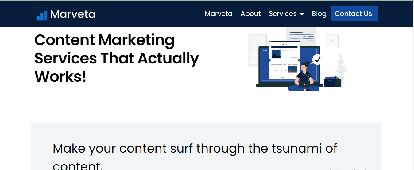
Why it works: The copy is sharp and concise, and states how Marveta can be the one stop solution for content marketing. The landing page further talks in detail about what Marveta can do for its customers and then lists the brands that it has worked with.
What can you apply: Great copy can hold your audience’s attention till they are convinced to take action, you can use it in your landing page. Listing brands that you’ve worked with helps you gain trust and recognition.
2. Airbnb
Source: airbnb.com
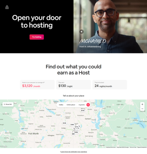
Why it works: The page is clear and has all important information about hosting with Airbnb. It offers personalization with its calculator that estimates earnings through Airbnb in a location. Potential hosts can find it very useful to have an idea of how much they’ll be earning. They can even contact superhosts to get any questions answered.
What can you apply: You can offer personalization on your landing page by offering a ROI calculator, calculate time saved in their process using the product, a revenue estimate calculator or a tax software. You can also offer easy contact with customer support to answer any queries quickly.
3. Talkspace
Source: talkspace.com
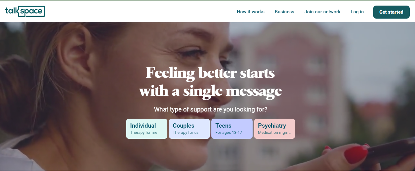
Why it works: The headline hits the point straight and offers the solution in the form of therapy. The page emphasizes that all therapists are licensed and their services are secured and reliable. Adding that the services are HIPAA compliant validates their claims. The page clearly shows the four categories in which support is offered, making finding help easy.
What can you apply: Display all categories of your product or service, so that the audience can find what fits their purpose without any hassle. Use certificates and compliances to validate your trustworthiness.
4. Zillow
Source: zillow.com
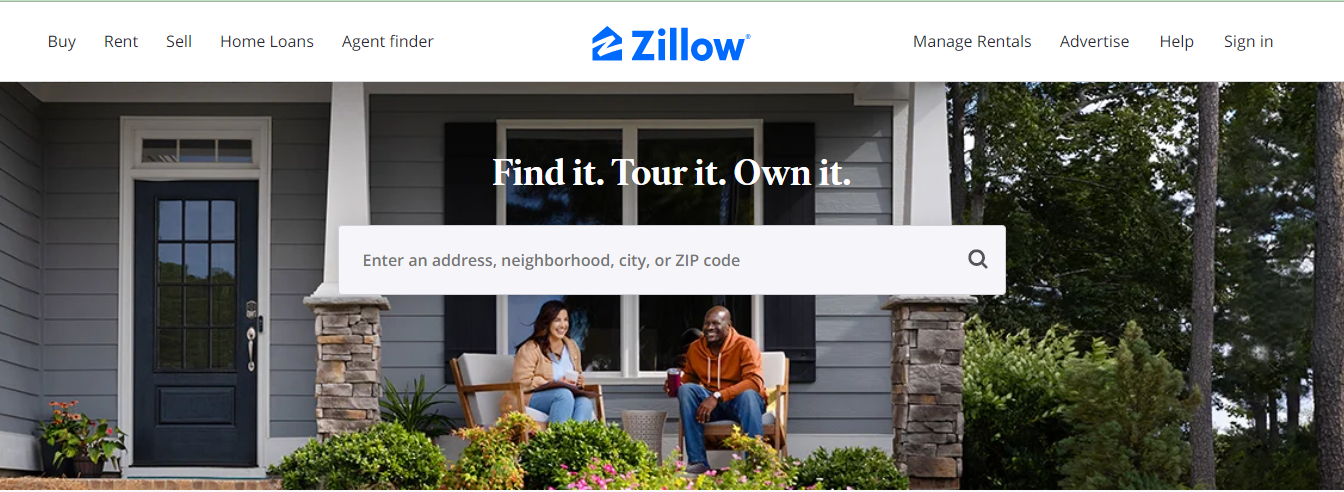
Why it works: The landing page starts by asking for the address or the ZIP code to show the worth of real estate in that area. It asks to sign up for detailed information on the property value. Further, the page divides into ‘Buy a home’, ‘Sell a home’ and ‘Rent a home’ to give a clear idea of all the services the platform provides.
What can you apply: Give clear information on all the services you offer on your landing page itself, so that customers can find what they want without much effort. Solitaire bliss is another example where you can find all information on the landing page itself. Like Airbnb, Zillow also uses personalization which you can apply to your brand.
Source: conversionlab.no
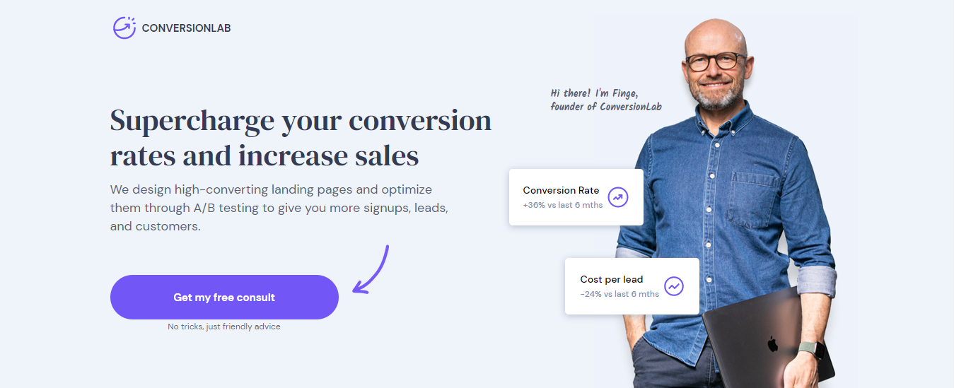
Why it works: The headline states a benefit the platform provides in big, bold text that catches attention immediately. The text below explains how the conversion lab can benefit the audience. It presents a compelling offer with ‘Get my free consult’ and also shows reviews of customers as social proof.
What can you apply: State clear benefits and use effective CTAs that urge your audience to click and take the next step. Use testimonials and reviews of clients and customers to establish your reliability.
Wrapping Up
Landing pages are your tool to connect with your audience and build a loyal customer base. Designing a social media landing page that actually works can help you skyrocket your business.
And pairing a great social media landing page with a platform like Sotrender can help you see growth like never before.
When it comes to ads, Sotrender goes beyond metrics like CPC, CPM, CPR, etc., to show an audience share metric which tells you which percentage of your target audience received your message.
You can also compare campaign spend with competitors to learn what campaigns are more profitable and in which ones they spend more money to get an idea of what you should focus on.
It will also help you understand what your audience likes best and give offers and benefits that attract them. This way, you’ll have a compelling social media landing page that motivates visitors to take action and improve conversions.


