Advertising on social media comes with multiple perks. You can narrow your targeting down almost perfectly when you advertise on platforms like Facebook and Instagram. However, even if you plan your budget perfectly and schedule your ads at the right time, your ads won’t help you reach your goals if the ads themselves are not interesting.
Let’s take a look at some of the best Instagram ads out there so you can learn how to catch your audience’s attention.
Introduction to advertising on Instagram
If you’re new to Instagram or haven’t set Instagram ads before, you might need a short summary to catch up with the latest details. Here’s what you need to know.
Instagram ads come in different formats, placements, and sizes. Ad formats can include photos, videos, and carousels. They can be found in your feed as you’re scrolling, as a Story while you switch between users, and while scrolling through the Explore page. Unlike Facebook Messenger, your Instagram inbox won’t have ads featured there.
There are two methods you can use to create Instagram ads. The one you pick is up to you, though we definitely have a preference for Facebook Ads Manager. You could have Facebook/Instagram choose the best placements for you though you can also manually choose the placements of your ads.
As for targeting, how do you actually set your Instagram target audience? Good marketers get to know their target audience and they have a specific type of user in mind. Thanks to Facebook and Instagram’s advanced targeting settings, you can easily narrow down your ad’s targeting to specific demographic features, behaviors, and interests. Obviously, the best Instagram ads are those that combine good copywriting, visuals, and know their audience.
Learn more about your target audience
All caught up? Then let’s take a look at some of the best Instagram ads that made rounds online.
Best Instagram Ads found in our Feeds
Ads that appear in your feed have to appear there seamlessly. They literally have to feel as though they’re supposed to be there, otherwise, they’re just too invasive. Considering that more or less every fourth post we see is an ad of some sort, it’s not surprising that users could easily get frustrated. It’s one thing when an ad grabs your attention, but another when you wish that you could use an AdBlock add-on for Instagram.
It’s not just about ads being invasive, though. There are other Instagram advertising mistakes that you can make along the way. Even if you think advertising on Instagram sounds like a piece of cake, you should still be aware of all the things that could go wrong.
Now we can look through some of the best ads we’ve found on Instagram.
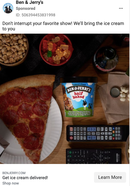
Let’s start off with an especially liked brand: Ben & Jerry’s.
We know what product is the star of this ad. The difference in brightness signals that you should obviously focus on the ice cream. They didn’t even need to put any text in the visual, plus the caption fits the context. It’s a good ad because it portrays a pretty realistic situation for a Friday night. It would definitely feel awkward if the ad felt more exclusive or glamorous. It’s a simple ad, but most of us don’t have to be convinced to buy ice cream.
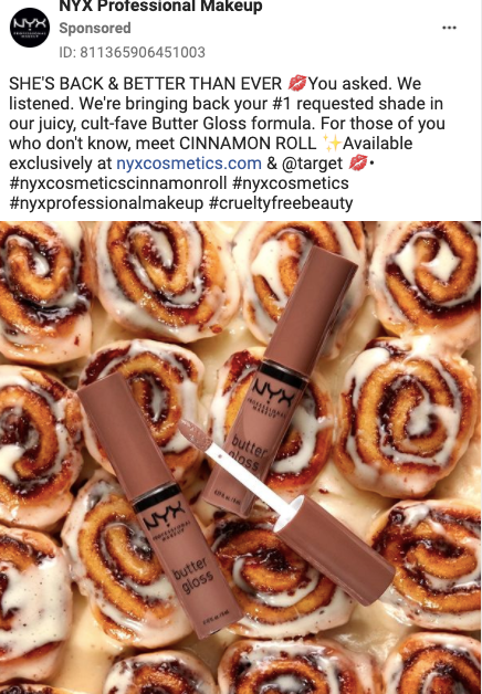
The next ad that you should pay attention to is this fun and creative ad by NYX. It hits all of the right points for those that love the brand’s products.
First of all, they knew that Butter Gloss is one of their best products, and they found out that their audience especially loved the shade “Cinnamon Roll”. Contrasting actual cinnamon rolls in the back with the Butter Gloss makes it more fun and campy for sure. Also, note how the hashtags are all relevant for their followers and customers. They’re carefully picked, brand-specific, and also able to get them better reach (especially the #crueltyfreebeauty hashtag).
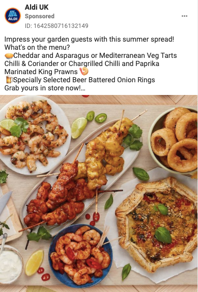 Aldi has their own way of reaching users when the weather is decent. Since they’re a supermarket, they didn’t even need to use any hashtags here. The copy and image featured in the ad were good enough to get the point across that you can make a perfectly good spread using the ingredients from their store. Overall, this ad was probably meant to remind users that they can get fresh and cheap ingredients at Aldi to prepare food for a decent BBQ.
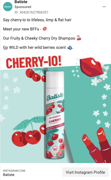
Batiste has gathered a large following of dedicated customers for three reasons: the product works well, there are so many scents to choose from, and the packaging is very well designed. On top of all that, their ads also work well. Finally, since it’s a brand from the UK, the play-on-words in the ad (cheerio/cherry-io) is campy and fun.
What should you take away from all of these?
- Don’t be shy about using hashtags on sponsored posts. We definitely recommend you learn how to properly use Instagram hashtags to reach the right users before you get started, though.
- Consider playing around with different formats. Carousel gives you the opportunity to showcase more of your products, whereas videos could be just as engaging for your audience and catch their attention more easily.
- The visuals should simultaneously blend into the feed and match the brand’s aesthetic. Make it feel like an organic post that they would usually see.
- Consider promoting your best content. It’s not like you have to create entirely new visuals for your ads. You can find your top posts in Instagram Insights or in another tool, and promote them to reach a bigger audience.
Best Instagram Story Ads
When you follow hundreds of accounts, it’s likely that you’ll swipe left on many user’s Stories. Not all of them will be as interesting one day, so you’ll just skip ahead to the next profile’s Story. Between those swipes, you’ll notice multiple ads that come up.
When planning your Story ad, you should make sure you follow these best practices:
- Have a balanced amount of text in the ad. It’s not Star Wars – you really don’t need an introduction to tell us about how your product is great in a galaxy far, far away.
- Consider the dimensions of your ad. You’ll have to have a separate visual that’s vertical, not just a square like the ones you oftentimes see in your feed.
- Make sure it’s easy to understand what you’re advertising and what users should be focused on.
- Keep the aesthetic consistent with your branding. If your main product is makeup, then vibrant colors would make sense, right?
- Don’t wait around, you have to immediately incentivize users. If the first part of your Story ad isn’t interesting enough, they’ll swipe to the next Story.
- If your goal is to generate hype and get users to interact with your company, consider making your ad interactive.
These are some basic tips, but you’d be surprised by how often an ad pops up that just isn’t easy to understand at all. Now we can show you some good examples of Instagram Story ads and why you should learn from them.
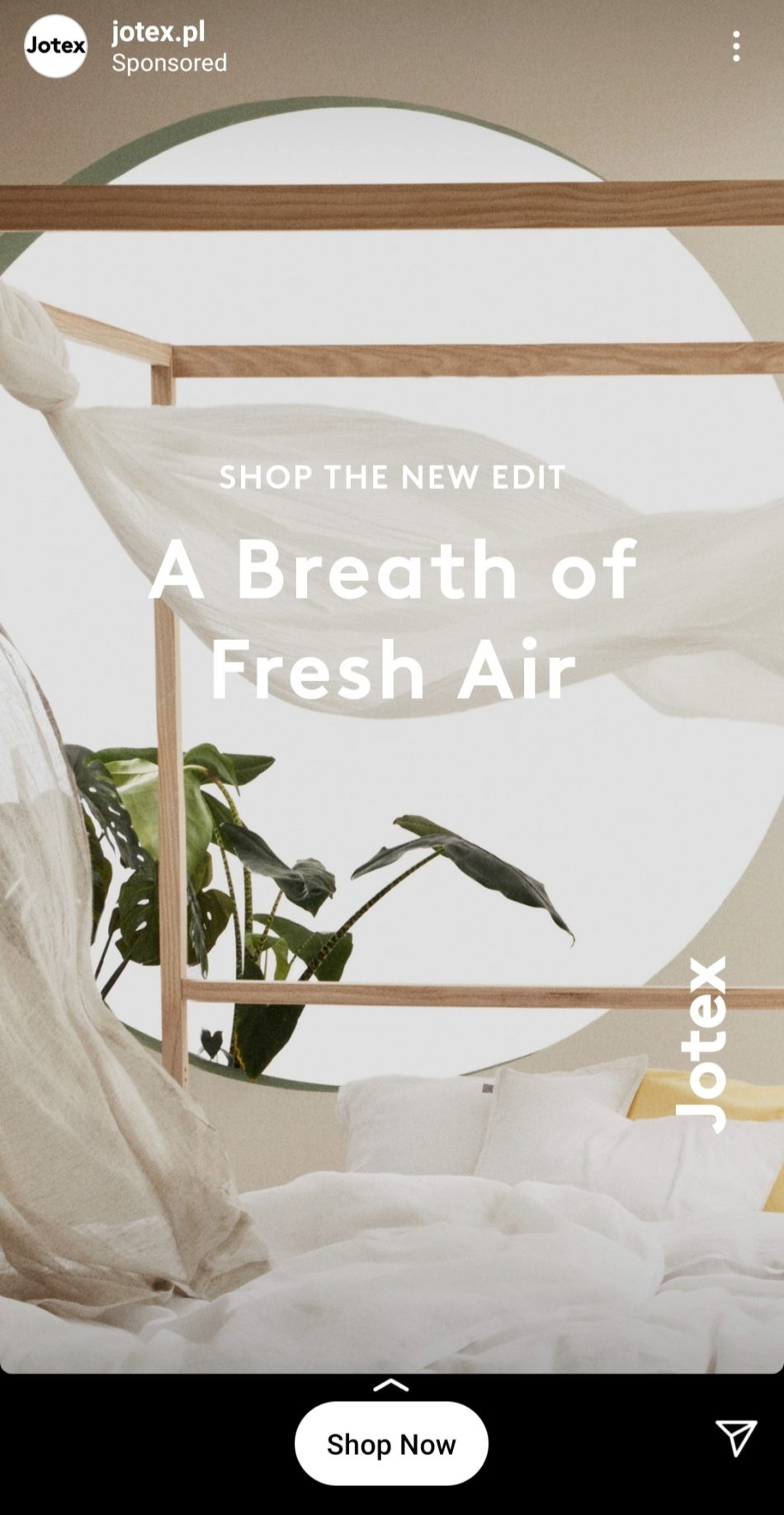
Starting off with Jotex, we can immediately see that they hit the target. To give you some context, they’re a furniture store that produces items that have a very modern design. Many of their products are simple and use a neutral color palette. The colors in their ad match perfectly to the same colors of their furniture and website, and the ad fits what they’re going for: simplicity. The text and image also make sense together and share the same message.
Apart from stylistic wins, they also get points for clarity. We obviously see that they’re selling furniture, so there’s no confusion. Overall, it was a good move on Jotex’s part.
This might seem weird, but having an ad that starts with all text isn’t necessarily that bad. The New Yorker had a great ad for their newspaper on Instagram, actually. They put out a video ad that starts off by telling you that you might have missed a few important articles, and then they start to go through recent headlines with pictures.
Right off the bat, they specify how much you’d have to pay and how much value you get out of their paper by subscribing. Just notice how they didn’t stuff their ad full of text – it was just enough to get the point across and to get started with showing you each headline.
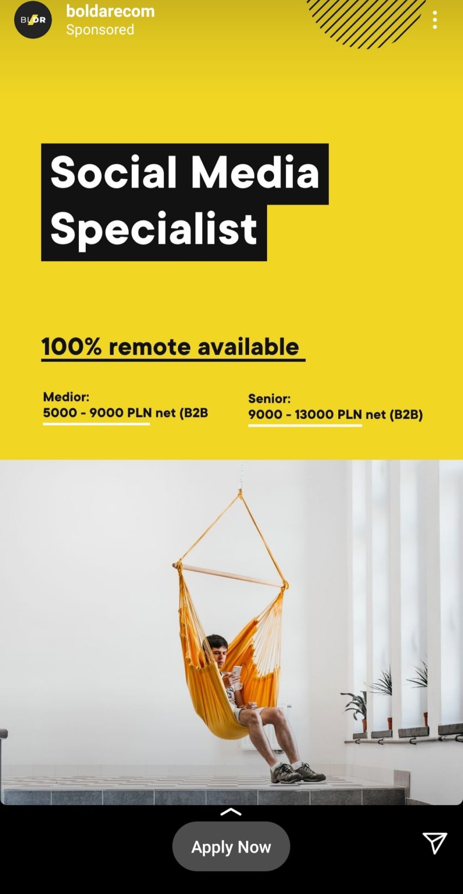
Looking for a new job? We guess that’s one thing that you might not have expected to find advertised on Instagram. It definitely makes sense, though. When your career involves spending longer amounts of time on social media, researching, keeping up with the latest trends, and checking up on what competitors post – it’s a relief to find that job advertised on the platform you use the most.
It’s definitely an unusual ad (as far as recruitment goes). The intense contrast between black and yellow easily catches your attention and matches the company’s aesthetic. They immediately specified the amount of money that applicants could potentially earn and the type of contract they could get. The CTA is also clearly visible and makes it easier for users to get more information and apply for the job straight away.
Overall, there’s not too much text, and there’s enough information to get you interested to find out more.
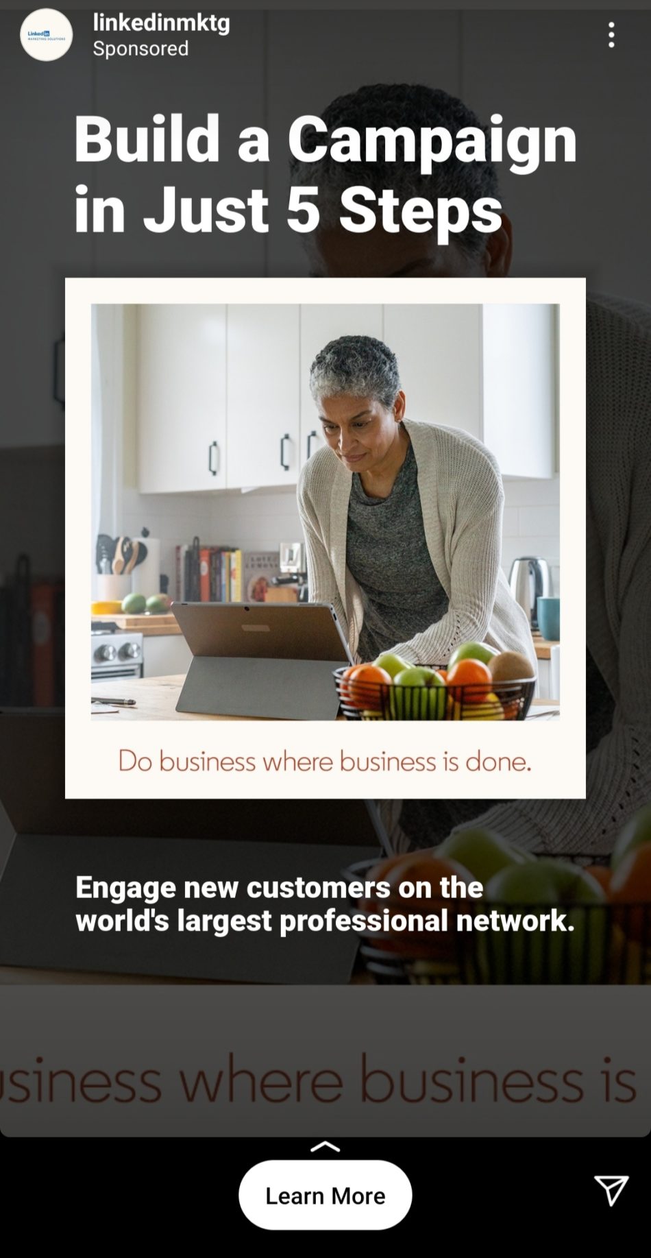
We’re definitely seeing more profession-related ads on our Stories these days. What made this ad stand out from some of the others we saw?
First of all, LinkedIn generally has a specific aesthetic on their Instagram. Pastel vs. dark colors for contrast, simplistic visuals, and minimal text on images. This broke away from that pattern. It immediately tells you how you’ll benefit: you’ll be able to plan a campaign in 5 steps. If we saw this ad in 2019, it wouldn’t make nearly as much sense, right? “Business” isn’t usually done in the kitchen, and corporate ads usually had people dressed in formal attire. Now that so many people work remotely, it makes sense.
Aside from hitting all of the formal aspects of a good ad, it generally makes sense because we’ve gotten used to seeing people working from the comfort of their kitchen in loungewear.
Get creative with your Instagram ads
We’ve covered all of the bases and now you know what to look for in a good Instagram ad. Even if you’re not an expert marketer with years of experience, you should be able to come up with an Instagram ad that fits what your audience wants.
We hope these ads will inspire you to make your own creative and campy ads that will pop. Just don’t forget to track your Instagram ad performance after your campaign ends so you can optimize your ads in the future.
How to do that?
Of course, you can use Facebook Ads Manager to check your social media performance, but you will get a more in-depth insight on your crucial KPIs using a comprehensive tool like Sotrender Ads. The data is presented on readable charts and it is easy to interpret even for a beginner.

Comparing link clicks in Sotrender Ads
Sotrender Ads enables you to:
- track key campaign indicators which are not available in Facebook Ads Manager,
- analyze results of your current or past campaigns and compare them between each other,
- optimize your future campaigns and manage your budgets more effectively,
- save time thanks to the possibility of generating reports in less than a minute.

