In the past few months, we’ve been working hard on developing Sotrender, adding new features and charts.
In the meantime, we’ve also talked with you, our clients, quite a lot. What we’ve discovered was that while we were focused on new things, we were hiding them somewhere in the app so well that some of you haven’t even noticed them!
This is again where we understood the value of communication with our customers, as it helped us to find out about actual problems, which we wouldn’t have realized on our own.
This is what led us to make the changes, which we are introducing you today. Although they might seem small, they will be definitely significant in everyday work with our app.
Choose the profile you want to analyze with ease
Let’s start with the menu, which has changed the most.
You can immediately notice that each section has now corresponding and refreshed icons.
The list of profiles managed on your account is also more aesthetic and easier to use, which you can see on the screenshot below.

Choosing profile in the refreshed Sotrender menu
… and dive deeper into data
Another significant change is how the menu actually looks like when you are already analyzing the selected profile.

This is how the new navigation in Sotrender app looks like
The new collapsed menu, which we have just implemented, means that under each section (Audience, Reach and engagement, and Content) you will see what charts and data are included in each of them. From the practical side, while using Sotrender you will always know where you are within the app and which data you have more to analyze in each section.
We hope that with the changed menu you will no longer have problems with exploring our app and finding all the data and charts it has to offer, for example, Content strategy.
If you wonder what the Content strategy actually is, you will find the answer in one of our blog posts. To keep it short, it’s a chart, which you will receive after adding proper tags to your Facebook posts to monitor which post categories (with which tags) are most effective in your brand’s communication.
Moreover, thanks to the highlighted navigation you clearly see in which place in the app you are right now.
Check how the new navigation works in practice.
Report even more efficiently
Reporting and comparison sections are now refreshed as well. Because these two are the most frequently used features, we decided that it is especially worth to simplify how they look and improve their use.
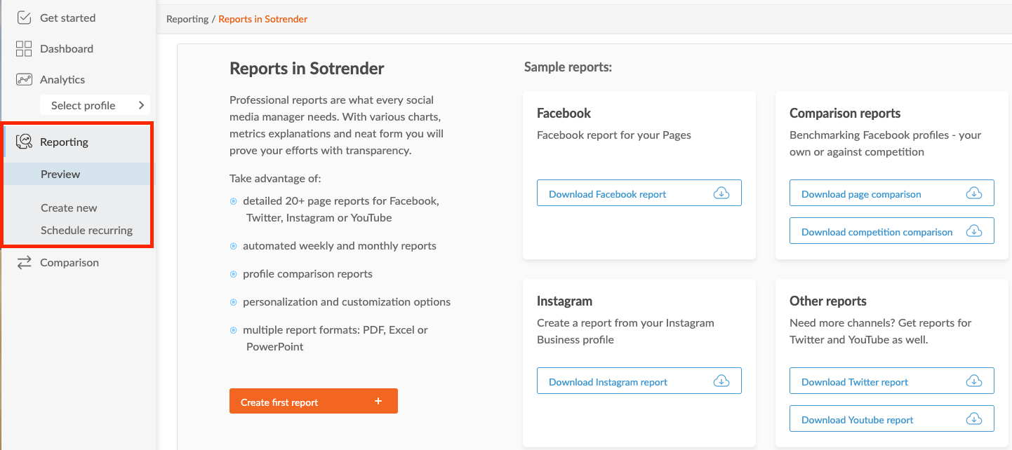
Automatically after selecting the Reporting tab from the menu, you can go directly to creating a new one-time report or scheduling recurring report.
What is more, users who will be starting their journey with Sotrender will see the introductory screen, in which they could see sample reports for each platform but also create their first report.

Refreshed reporting section in Sotrender
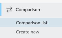
A similar change happened in the Comparison section. Right from the menu you can now go directly to the list of already created comparisons or create a new comparison group.

New comparison section look
Pro tip:
Remember that if you want to create a comparison report, you first need to create a comparison group in the Comparison section.
The changes which we have now introduced will help both current clients, as well as the new ones users:
- users, who already know our app well, can go directly from the menu to the section, which they are interested in at that time, for example to creating a new report or comparison group, which means doing what is needed to be done quicker;
- newcomers, on the other hand, will immediately see all the possibilities and data Sotrender has to offer; right from the menu they will see all the charts which are available in each section, which will help them to learn Sotrender quicker and benefit from using it even faster.
… and add more profiles, if needed
If you are wondering, where you can now add another profile to your account, you will now find it in the top right corner in the app, next to account settings.

The add profile button is now in the top right corner
So, shall we start?
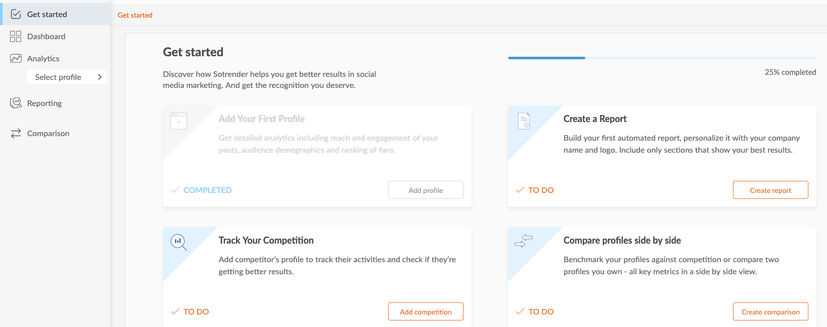
There is also one more new thing. The new introductory view will make it easier for new users to:
- start using Sotrender,
- benefit fully from using it,
- understand how the tool looks and works,
- find out about all the features available in Sotrender.

The new introductory view in Sotrender
Even though all these changes may seem insignificant, after talking to our customers, we believe that they will have an actual impact on your everyday work and have a pleasant experience from using our tool on a daily basis.
If you have any questions regarding the changes which we have just implemented, our Customer Success Team is always there for you. Feel free to contact us on chat or by email (support@sotrender.com).


