On Thursday Mark Zuckerberg spoke about Facebook main mission, namely “to make the world more open and connected”. He also emphasized that Facebook aims to be “the best personalized newspaper” for users. How does this new feed design meet this requirements?
Evolving face of News Feed depends on how we use it and what we share with friends.
The changes focus on three main things:
– Richer stories
– Choice of feeds
– Mobile consistency
Richer stories
They say one image is worth more than one thousand words, and reflecting the fact that photographs now account for 50% of all content on news feed, one of the three big changes is to, quoting Julie Zhuo, Director of Design, “design the best container to let these stories shine”
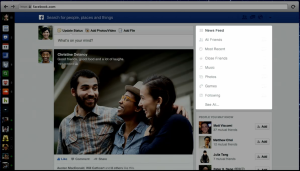
Activities defined , until now, with only one, small avatar and a short text message about liking or joining a fanpage will soon get a new look. Photographs, likes, check-ins and other updates will appear larger on the altered news feed, which also features a new left-hand navigation bar and separate tabs for music and games. With larger and more visible images there will be no need to enter a specific fanpage to learn what it is about. Moreover, links will appear more readable thanks to the articles with more visible content, large titles and pics.
These changes will especially be significant and useful for marketers, evolving in a tool that allows to develop more catchy ads that will appear alongside images, videos and other updates in users’ news feed. Every ‘like’ from one user will potentially encourage its friends to review it.
Choice of Feeds
In a current feed we see an enormous amount of all kinds of information, which may be a bit disheartening for users. People want more control of the stories that they see on their homepage and that is why Facebook enables users to choose exactly what they want to follow. For example, if you pick Music, you will see events, pictures, upcoming albums etc., of your favourite musicians and bands. Choosing ‘All friends’ you will see what they are up to, and with ‘Following Feed’ you can check out the newest activities on pages you liked. Furthermore, let’s not forget about Games Feed, that helps you stay up to date with activities on your social games.
Mobile Consistency
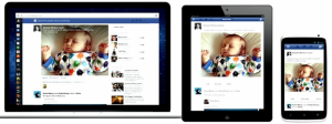
The way of remodeling News Feed was opposite to what we used to – mobile apps will not be based on Facebooks browser look. This time the inspiration was the capability and specification of mobile platforms itself. News Feed is supposed to be simple and readable, so apps on mobiles have to be the same. Thanks to that unifying improvement the website on smartphone will look practically the same as on tablet or monitor.
Facebook said this overhaul is a step in a direction they want to go in general. We can already notice some changes, but taking into consideration how big this redesign is going to be, it has to be done slowly and carefully, tested on a small group with the goal of getting a lot of feedback.
The new design will be gradually made available over the coming weeks, with users able to sign up to a waiting list for early access.

